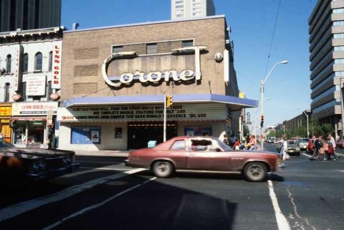
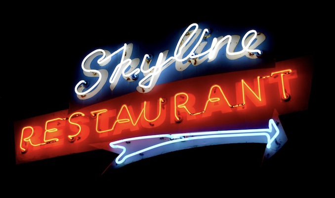
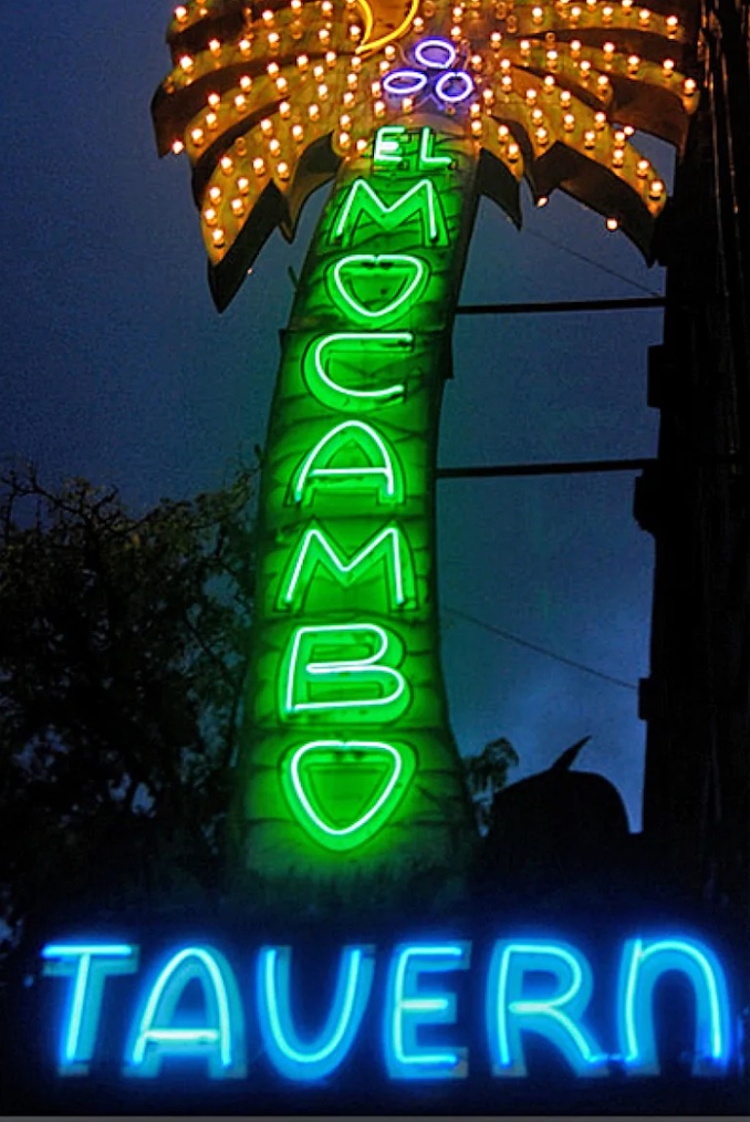
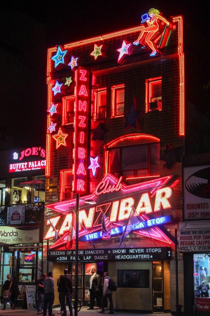
As a kid, Neon signs meant one thing to me; they meant you were someplace. If a building had a neon sign it was telling you ‘this is where the action is’. Churches didn’t have neon signs and neither did police stations. Neon signs were for bars, casinos, late night diners, the sort of places that intrigued and made you wonder what possibilities lay behind those doors, bricks and glass. When my dad drove me downtown to pick up Chinese food at Lichee Gardens on Sunday night, we always drove down Yonge Street so I could take them all in. I can easily replay the route based on the signs we passed like the blue Coronet Theatre sign, and the bright red of the Zanzibar.
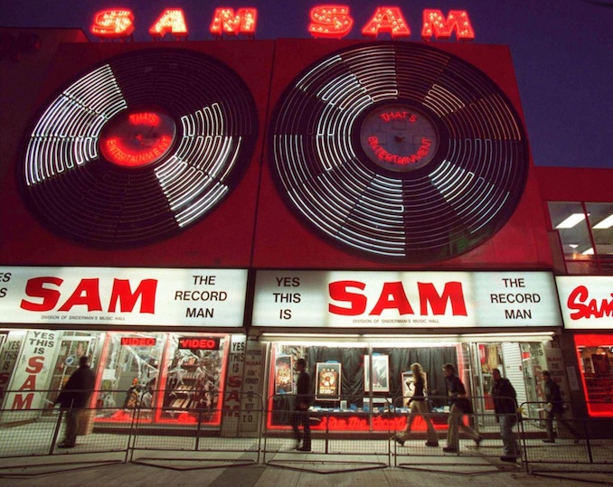
Heading south, neons increased in frequency and size until, just north of Dundas, the mother of them all shone the brightest and spoke the loudest; the double platter of Sam the Record Man.
As I grew a bit older and could venture downtown on my own, Sam’s was among the first places I frequented. It helped that I was a hopeless lover of music and records, but the intrigue of the giant red and white sign was what really brought me in. Eventually, I even got a job in the store and loved finishing a shift late on a summer night and walking out into the red-neon blanketed street.
There is a grittiness to neon, that perhaps made it less appealing as the city modernized and matured. Inevitably, slowly the signs disappeared. Certainly as the businesses changed and new ones opened, neon did not play as big a role. The Yonge street of the 2010’s was almost unrecognizable from its 1970’s counterpart. Now, Toronto’s downtown is decidedly more modern, but feels less like the ‘someplace’ where I grew up. Walking the same street today I find myself wondering where the action is now. As Gertrude Stein once said, “there is no there there” anymore.
The Sam’s sign was turned off when the store shut in 2007, and like so much of Toronto’s amazing neon art, its future was uncertain. When the building was bought by Ryerson University they committed to restoring the sign and keeping it on display, pretty much where it had lived since it was first put up in the 60’s. But that is not what happened. For years Ryerson dragged its feet claiming the high cost of restoration made the project untenable. The sign finally did get the love it deserved, but was mounted in a new home on Victoria street.
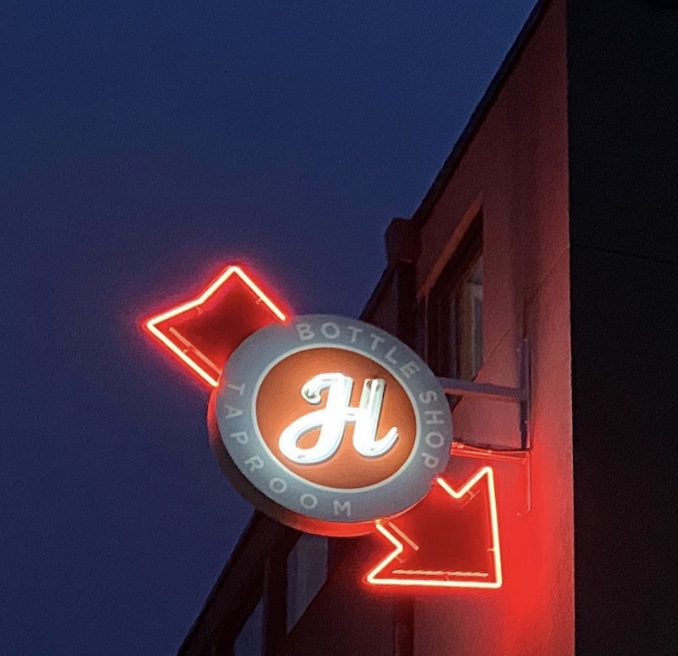
When we opened up Henderson in 2015 we knew a neon sign was in the cards. The craftsmanship and uniqueness of them keeps them very attractive to me personally, and reflects the values of our brand at Henderson. Plus, I wanted to tell people that this is where the action is. Closing the tap room on a summer night and walking out into the blue and red glow of the neon still makes me happy.
As we have done for 6 years here at the Brewery, we used this Toronto Icon as inspiration for one of our monthly ‘Ides’ beers. Red and vibrant, like the sign itself, our “Sam, Sam” Cherry Hibiscus Blonde Ale is bubbly, refreshing and simple. Like our little sign above the tap room, this is our homage to the neon that lit the streets of our city when it was a bit grittier and less polished.
I read last year that there is a proposed neon museum set for the city run by Mark Garner (executive director and COO of the Downtown Yonge Business Improvement Association). In 2022 they are planning for pop up museums around the city to display the signs they have already collected and restored. Hey Mark, I’ve got the perfect beer to toast your opening.
-Steve Himel is the GM & Co-Founder, Henderson Brewing Company and a lover of neon signs
***
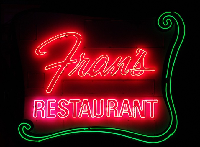
More of Steve’s Favourite Signs
