Artist Evan Munday is a seemingly inexhaustible source of positive energy in Toronto, where he participates actively both in the literary and comics communities. When he is not as his day job as the publicist for Coach House Books, Evan is busy writing and illustrating stories about sexy supervillains, dead teen detectives, and post-apocalyptic twenty-somethings.
How would you describe your own creative style?
I like to think I combine the fantastic and the extremely mundane in a vaguely pleasing and mildly amusing way. My illustration work is some unholy hybrid of cartoon and realism, and my writing attempts to be witty but touching, but likely relies on far too many cultural references for its own good. Also, I think I’m obsessed with death in a very real and strange way. Goth Norman Rockwell meets Sunday Comics Dennis Miller.
What is your favourite medium to use and why? How do you combine different forms of media in your work?
Ink on paper is still my favourite.When I was a kid, I thought I’d never be able to ink illustrations the proper way because I press too hard with a pen (which makes using pen nibs really difficult,and often breaks them). But I idolized cartoonist Mike Allred (Madman) and was determined to learn how to ink using a brush, just as he did. I’m still not that great at it, but am so glad I worked at it. Doing a solid inking job with a brush is,without hyperbole, probably more satisfying than any other accomplishment in life.
What is your preferred genre to work in?
I love comic books. I read more comic books than anything else and have for years; I just fear I’m not ‘good enough’ at making them. It’s my preferred medium, but I’m still very insecure about my abilities in the genre and almost cringe at being referred to as a comic illustrator. Also, making comic books takes so very long, so creators usually have a love-hate relationship with it.
What kinds of images do you find most moving? What kinds of images disturb you?
I think one of the images I found most moving (over all time) was a layout from Chris Ware’s Jimmy Corrigan, the Smartest Kid on Earth. In a wordless series of panels he tells the family story of two characters so succinctly and tragically. It was one of those feats that remind you of what comics are capable of. I’m also a sucker for that final shot of Fry’s Dog Seymour, in the Futurama episode ‘Jurassic Bark.’ I start to cry every time.
As for disturbing images, I’m sure they are legion.I just survived a six-movie grindhouse movie marathon this past weekend, and the closing shot ofthe movie Sleepaway Camp has certainly scarred my psyche. In terms of superhero comics, I think any illustrated instances of ‘fridging’ (the death, serious injury or sexual degradation of female comic characters that serves merely as a plot point in a male character’s story) leave a very bad taste in my mouth.
You often illustrate your own work — in fact, you have two series in progress that you both write and illustrate. Do you find illustrating your own work easier or more challenging?
I would gladly illustrate my own work before anyone else’s. I’ve done both (as you know!), and illustrating someone else’s work is difficult! Collaborating with someone is great because the synthesis of your two styles and various ideas can often create something much better than one of you alone could, and it’s fun exploring someone else’s head creatively. But no matter how great the partnership, there’s always something I’m not going to understand about the writer’s words. Some nuance or tone or some aspect I miss, and it can be hard for a writer to convey that. Particularly if I, as illustrator, have already tried and failed to put their words and concepts into art a few times. Writers sometimes will take pity and think ‘oh, that’s pretty close.’
Illustrating my own work, I know exactly what I have in mind, and it’s only my own ability that limits me from achieving exactly the images I pictured in my head.
One of your projects is The Dead Kid Detective Agency, a series of young adult novels. What are some of the joys and challenges of writing and drawing for a younger audience?
Almost everything about it is a joy. I think the real advantage of writing for younger audiences is that the readers think about the characters as real people. They think less about the book as a piece of art and more as story. They want to know what happens next, what exists outside the borders of the book cover. As much as I like theory, writing for children reminds you why you started loving books in the first place. And it can be nice to revisit your childhood years for material. Writing for a younger audience is perfect for exacting revenge on terrible teachers and unpleasant classmates, as well as for venerating friends of your youth and assorted adults you admired.
The real challenge is reading level. I have very warped ideas of what is appropriate for ages 9 to 12 in terms of vocabulary and content. I think my first version of The Dead Kid Detective Agency dropped the f-bomb a couple times. But my policy has been to write the type of book I imagine I would have liked to read at that age, then my trusty and skilled editor at ECW Press, Erin Creasey, tells me that, you know, I can’t make offhand, casual references to wrist-cutting in a kids’ book.
It can also be a challenge to get inside the head of a thirteen-year-old girl (my protagonist), as I’ve never been a girl and it’s been a long while since I was thirteen, but I think I’m managing. Another issue is that I tend to use a fair amount of obscure cultural references, largely from the ’80s and ’90s. Some of these cultural touchstones still have resonance with children, but for the others, we include a handy Appendix in the Dead Kid books that inform children what such things as Kodak cameras and Anthony Michael Halls are.
Your other ongoing project is Quarter-Life Crisis, a post-apocalyptic story set in Toronto. Is the apocalypse fun to draw?
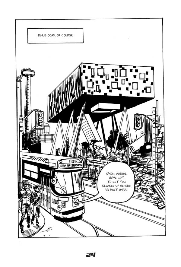
The apocalypse is super-fun to draw. When I was in high school, I wrote and drew a few issues of a comic book entitled The Post-Apocalyptic Warriors of the Post-Apocalypse (clearly a prototype for Quarter-Life Crisis), but it was set in a largely featureless desert. I think Quarter-Life Crisis is light years better, because the setting is Toronto post-disaster. I can draw the CN Tower cracked in half and Shoppers Drug Marts overrun with paramilitary types.
My secret is that I’m very bad at drawing backgrounds, so I have to use a lot of reference photographs. Setting my comic in a post-apocalyptic Toronto was very handy. I also enjoy the post-apocalyptic fashions, because they’re basically Street Style photos merged with Mad Max. You can give bankers Adam Ant makeovers and no one questions it. It’s the post-apocalypse, man! There are no laws! It’s Thunderdome! (Technically, Thunderdome has one law, but you catch my drift.)
You have collaborated with several writers on non-comic book projects, such as Jon Paul Fiorentino’s illustrated novel Stripmalling and Natalie Zina Walschots’ (me!) DOOM: Love Poems for Supervillains. How does illustrating someone else’s project differ, in process, from illustrating your own writing?
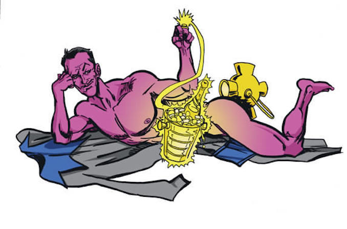
As I mentioned, it has its advantages and disadvantages. For one, I’m drawing things I’d probably never draw in my own work. Weak as my imagination is, I’ve never written a story that called on me to draw a nude Dr. Octopus, for instance. So working with other writers really causes me to stretch my drawing muscles and explore new material. You can get too comfortable illustrating your own work.
There’s also a great deal more back-and-forth. I’m editing as I go along in terms of layout, character design and composition when I draw my own work. Working with a writer, I draw thumbnails, send them off for approval. I draw pencils, send them off for approval. Because I can’t read the writers’ minds, as much as I try (that’s basically my end goal), I want to be sure they’re happy with how things are taking shape.
Some of your work is sexy, and some is downright explicit. How are you able to capture such fun, silly at times but always erotic moments in your work?
Is it? I find this very funny because I’ve always shied away from sex in the work I write for myself, but most of my collaborative work has involved a fair amount of explicit sex. Fun fact: I was so weird about sex for years that I was truly afraid of drawing women’s bodies. I was so worried that if I practiced drawing breasts and hips that I’d be labeled a pervert by someone perusing my sketchbook, and I think my illustrations of women suffer from that lack of practice to this day.
But yes, in collaboration, I often deal in sex. My first ‘big break’ in illustration happened in second-year university. I was asked to illustrate a double-page spread for the frosh issue of Imprint (the University of Waterloo’s student paper). The article was called ‘How to Have Sex,’ and featured informative tips on safe sex, respect for roommates, respecting your partners and so on. But my illustrations were airplane-safety-card diagrams of sexual positions (complete with arrows). The figures were fully clothed in these illustrations, but the issue was nevertheless pulled from all student residences. My first taste of notoriety!
And both your book and Jon Paul Fiorentino’s have called on me to draw the erotic or sexual. (One illustration in Stripmalling was cropped because Fiorentino thought it was TOO explicit!) I have no idea why this is. Clearly I’m sending out these sexual vibes that I’m unaware of to the writing community. I’m just able to tap into the sexual jetstream of North American culture, clearly.
I’m sure it’s partially my lingering discomfort with sex that leads me to make it funny and/or silly. But at the same time, I’d like to think sex is fun and at times funny. There are enough people out there who can draw serious sexy. I’d prefer to trade in the funny sexy. In the same way certain people are drawn to burlesque over stripping, because the burlesque tends to acknowledge the humour and fun in sex in a way stripping doesn’t.
What do you love drawing above all else?
I really like drawing faces. I’m sure that’s a common thing among illustrators, but you just can’t beat a good face. Also, since beginning the Quarter-Life Crisis series, I’ve grown very fond of drawing Toronto streetcars. They’re not the easiest things to draw in the world, but if you get it right, they have a really pleasing shape.
Where can we see more of your work?
Aside from all the books out there, I post things on my website, though lately it’s more been posts about movies of questionable taste that I enjoy.


